

Introduction
Flexbox, also referred to as CSS Flexible Box Layout, is a web layout concept for CSS 3. It intends to provide a more effective way to arrange, align, and allocate space among things in a container even when their sizes are uncertain or changing. Without using float or positioning, the Flexible Box Layout Module makes it simpler to develop flexible and responsive layout patterns. In a container, responsive elements can be automatically positioned using the flex layout in line with the size of the viewport. Items can be shrunk or expanded in flex containers to prevent overflow or fill empty space.
Basic terminologies of CSS Flexbox
Flexbox involves several things, including its entire set of properties, because it is a whole module rather than a single property. Some of them should be positioned on the container as the parent element, known as a flex container. The Flexbox properties for the parent is called Flex Container or parent.
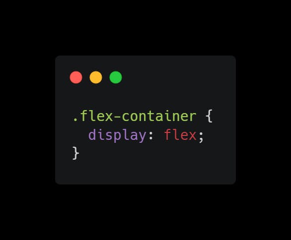
The display property
This creates a flexible container, which is made flexible by assigning the display property to flex.
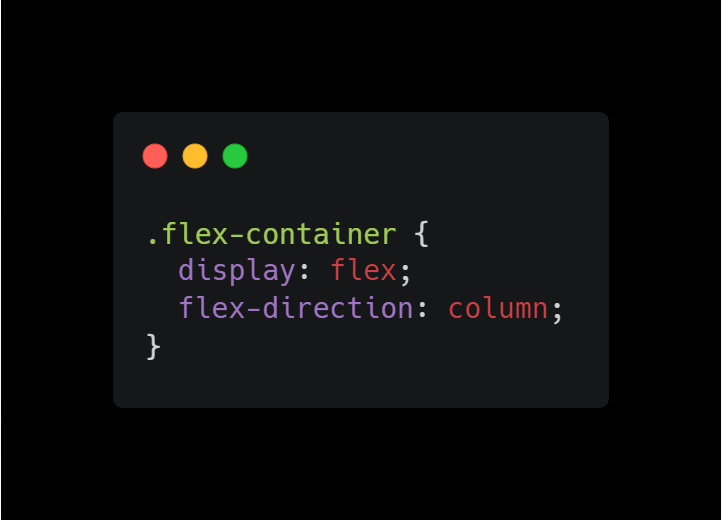
The flex-direction property
This determines the main axis, and the direction in which the container intends to arrange the flex elements. It can be arranged by setting the flex-direction to column, column-reverse, row, and row-reverse.
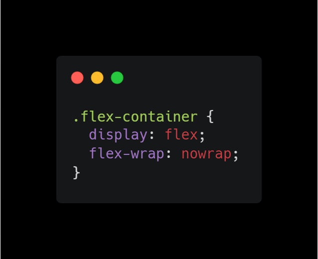
The flex-wrap property
The value of this attribute indicates whether or not the flex items should wrap. With this attribute, the flex-wrap enables the elements to wrap as necessary. It can be wrapped by setting the flex-wrap to wrap, nowrap, and wrap-reverse.
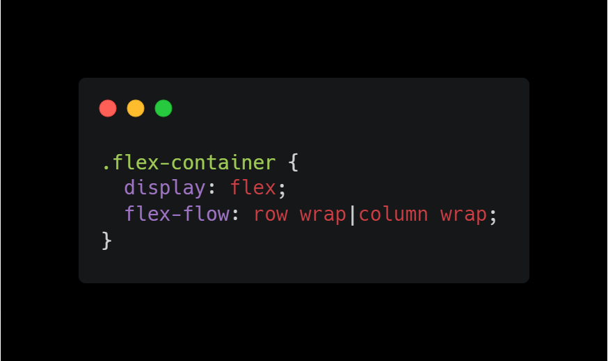
The flex-flow property
This serves as an alternative to the attributes flex-direction and flex-wrap.
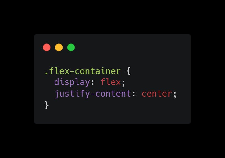
The justify-content property
The flex items are aligned horizontally with the help of the justify-content property. When all of the flexible items on a line are either rigid or flexible but have reached their maximum size, it helps spread any surplus free space that is available. You can justify the content using center, flex-start, flex-end, space-around and space-between values.
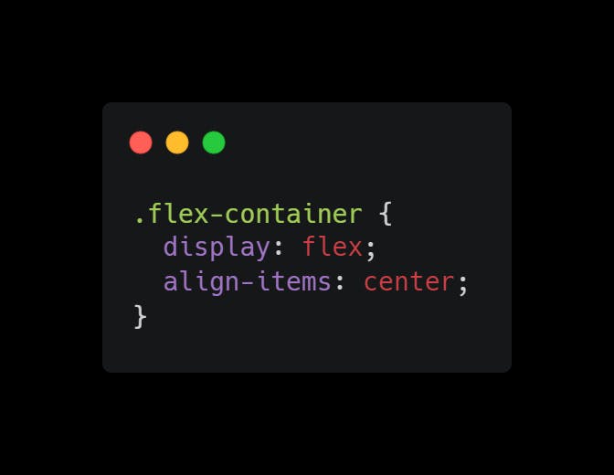
The align-items property
The flex items are aligned using the align-items attribute. This specifies how flex elements are arranged along the cross axis on the current line by default. Items are aligned using the center, flex-start, flex-end, stretch, and baseline values.
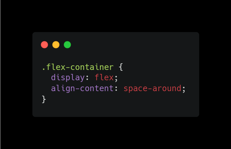
The align-content property
The flex lines are aligned using the align-content attribute. When there is additional space in the cross-axis, this aligns the lines inside a flexible container. It is similar to align-items. The contents are aligned using the center, flex-start, flex-end, stretch,space-between, and space-around values.
Check out this CSS Flexbox illustration to learn how I created a simple CSS Flexbox using each property.
Browser Support
The flexbox properties are supported in all modern browsers for desktop: Chrome: 57, Firefox: 52, Edge: 16, and Safari: 10.1. While for mobile/tablet Android Chrome: 103, Android Firefox: 102, Android: 103, and iOS Safari: 10.3.
Thank you for reading this article. If you enjoyed it, please stick around for more.