

Table of contents
A web layout system with two dimensions is CSS Grid Layout. It enables you to arrange content in rows and columns.
An example of a CSS grid layout
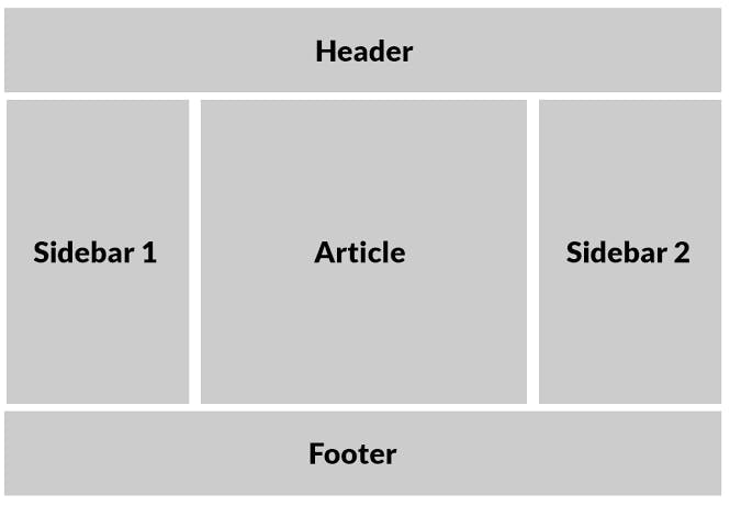
Photo by CSS-Tricks.
What Is Grid
Before CSS Grid became a viable option, we had to use either our own special bespoke grid system or something similar to Bootstrap. CSS Grid Layout, sometimes referred to as "Grid" or "CSS Grid," radically changes how we construct user interfaces as compared to any prior online layout system. Since we've been building websites, we've all been tinkering with layout issues. The Grid is the first CSS module built specifically to address these issues.
Basic terminologies of CSS Grid
The grid container, often known as the container, is the parent property for several grid attributes.
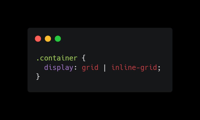
The display property
For the element to operate as a grid container and create a new grid formatting context for its contents, you must set the display attribute to grid or inline-grid.
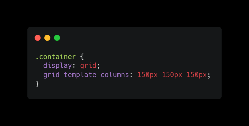
The grid-template-columns property
The property allows you to specify the number of columns in your grid layout as well as the width of each column.
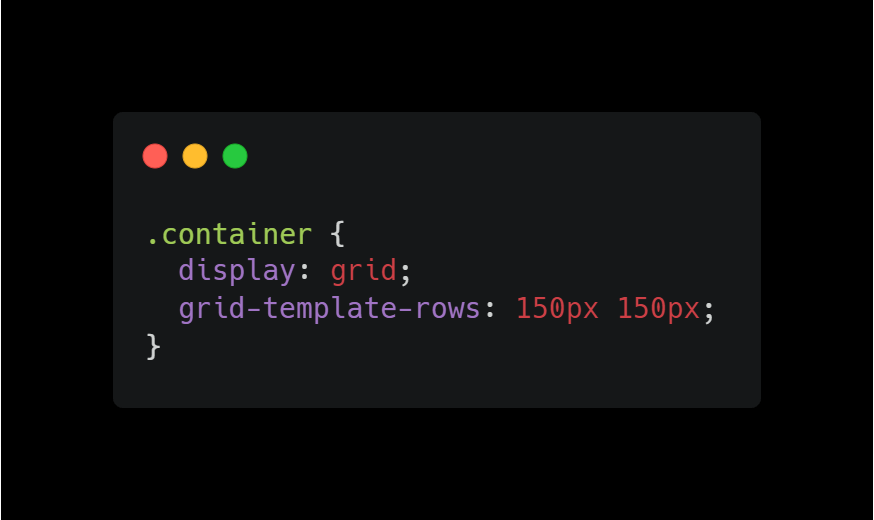
The grid-template-rows property
The property allows you to specify the height of each row.
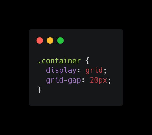
The grid-gap property
Gaps are the empty spaces that exist between each column and each row. The gap property serves as a shorthand for the row-gap and column-gap properties, which define the distance between each attribute.
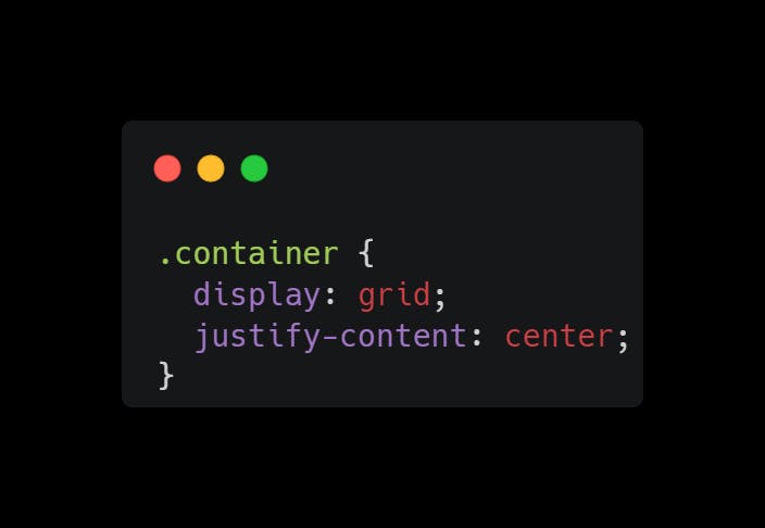
The justify-content property
In order for the justify-content property to work, the width total must be less than the container's width. The entire grid inside the container is used to align the entire grid inside the container. You can justify-content using space-evenly, space-around, space-between, center, start, and end.
The align-content property
The grid is completely vertically aligned inside the container using the attribute. To have an impact on the align-content attribute, the grid total height must be lower than the container height. You can align content using space-evenly, space-around, space-between, center, start, and end.

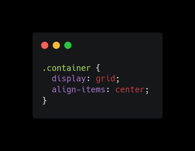
The align-items property
When the size of the items differs, align-items align them with one another. You can align an item using space-evenly, space-around, space-between, center, start, and end.
Making a basic three-column grid
The three-column grid will be made up of all the examples we provided previously.
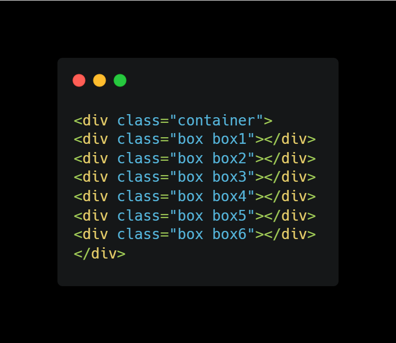
HTML code
CSS code
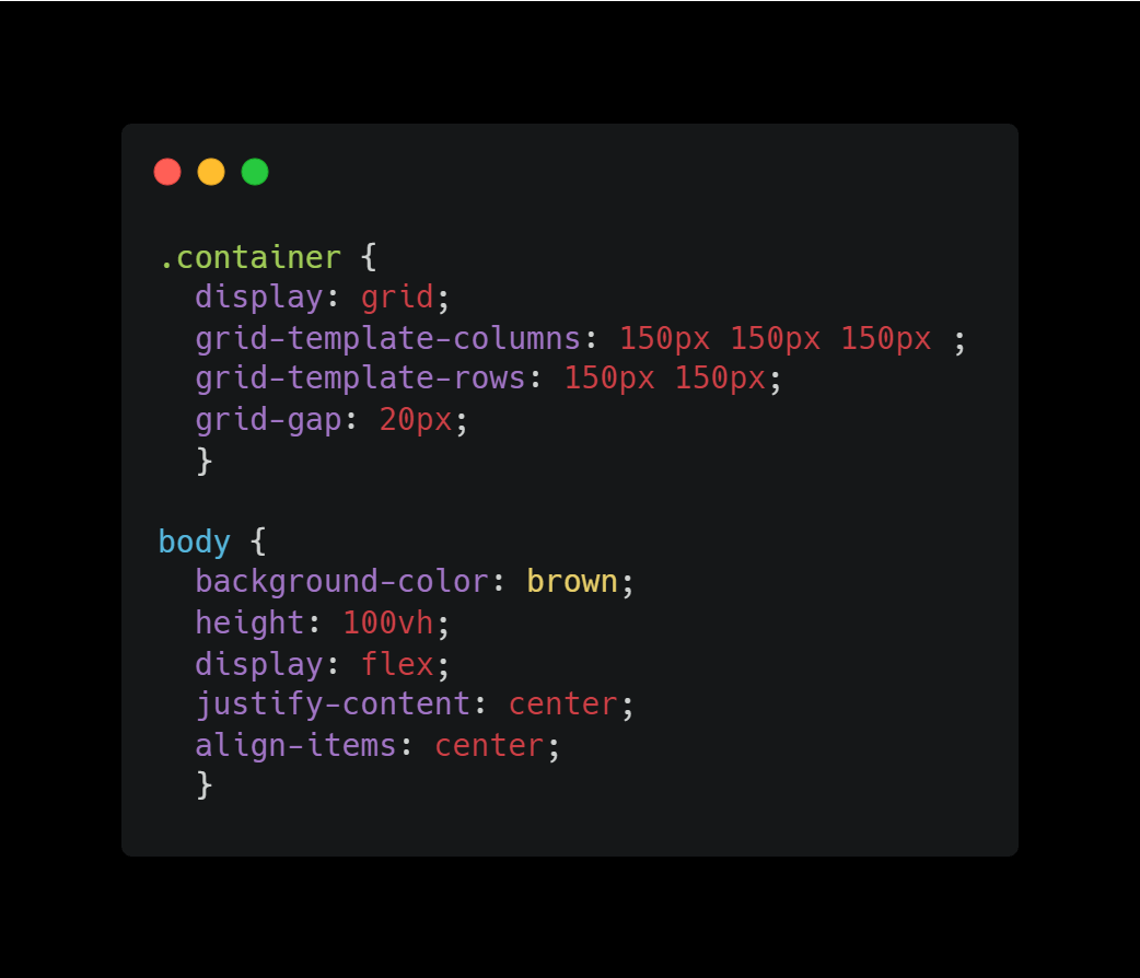
Here is a sample of a CSS grid. Check the source code to see how I used each property to construct a CSS grid.
Browser Support
The grid properties are supported in all modern browsers for desktop, Chrome: 57, Firefox: 52, Edge: 16, and Safari: 10.1. While for mobile/tablet Android Chrome: 103, Android Firefox: 102, Android: 103, iOS Safari: 10.3.
Thank you for reading this article. If you enjoyed it, please stick around for more.